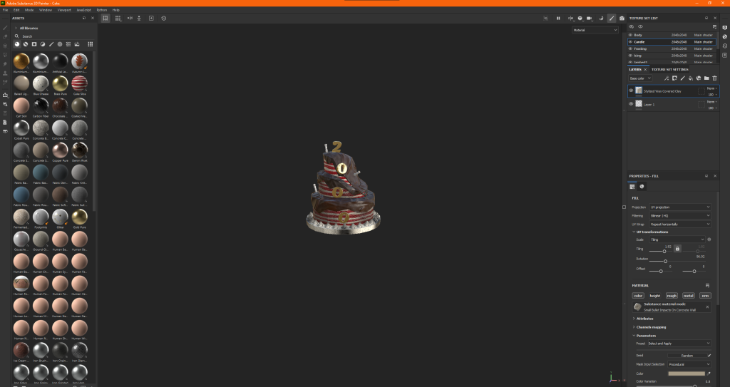
Categories
Games Design and Prototyping

Prototype 1: Ducky ClickR.

Concept Stage:

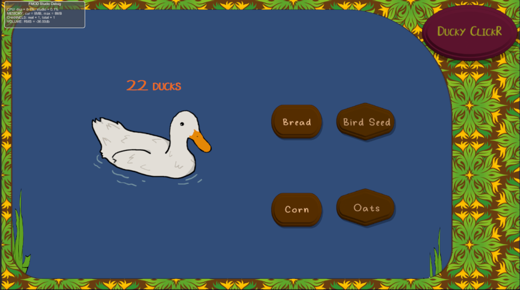
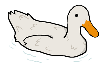
When tasked to create a portfolio of several prototypes to show my proficiency within the Unity Engine as well as external programs such as Fmod and overall competency when creating a game, we was also given a basis on what these prototypes were to be built around. The first of which, an idle clicker game, similar to the like of the popular “Cookie Clicker” style games. As with all good projects, mine started with an idea. Whilst brainstorming a theme for my prototype, I wanted my game to be a way to relax and destress. I pictured calming environments and envisioned a tranquil pond, what do you find at ponds? Ducks. It just so happened that Ducky Rhymed with Cookie and thus gave my Title: DuckyClickR

With a tone and idea in mind, now was the time to think about the gameplay loop. Of course with “Idle” styled games they’re designed to be simple and not take much input on the player therefore I looked for inspiration onto how I would be able to make a rewarding gameplay loop with minimal player input. After playing a browser version of Cookie Clicker (https://orteil.dashnet.org/cookieclicker/), I knew I had found a rewarding gameplay loop. My clicking to gain points (or ducks in my case) I could then allow the player to spend those points for upgrades into their point production, such as automating point production or adding a multiplier to each click of the primary button.

Design Stage:

Following my initial concepts, I began to work on some design elements, such as sketching out an early interpretation of what my UI could look like; as well as using specialised software to begin making important assets such as my main button pictured here:

Moreover, this was the stage in which I set up a new Unity Project using standardised 2022.1.7f1 Version I would continue to use throughout my later prototypes. Whilst I had dabbled in Unity prior, truth be told I was much more familiar with the likes of Unreal engine over Unity, I looked forward to this endeavour though to not only broaden my horizons, but also give me a fair challenge (which it certainly did).

A few early versions of what soon became the upgrade buttons for my prototype
the two images which combined made my boarder for the game. These like the Buttons were made in Adobe Illustrator.

I set up the Project titled “Ducky_Clicker_v01” in a 2D Core template and begun work on my new prototype.

Implementation

I began my prototype by setting up the project window to my liking, this included setting up folders for sprites, scenes and fonts as well as separating the scene and game views, this way I could view both my editor and how my UI would look in 1920 x 1080 (this was done by changing the game view from free aspect to 1920 x 1080 via a drop down menu) like so:

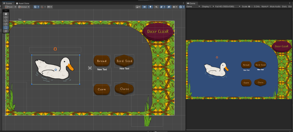
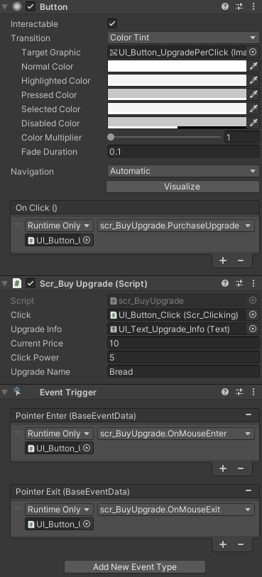
I began blocking out my UI by adding a canvas to the scene in which I then placed 3 Buttons, one as the Primary “Clicker” and two for Upgrades. These would act as the interactable with the player. Following this I then imported all outside assets like my buttons as well as a custom text font created by Seeduck on https://www.dafont.com/duck-2.font.

I subsequently created a script named “scrClicking” in the matching folder which would allow me to set the starting number of ducks collected, as well as allow me to increment them by one for every click

Void update calls the code underneath it every frame, therefor the program is constantly checking that counter. Text is updated correctly.

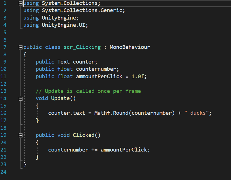
This was done by use of two variables, “counternumber” and “ammountPerClick”. These two decimal floats (which were originally Integers which I changed later for better compatibility with upgrades) allow the program to easily track and increase the count of ducks overtime. Upon reflection however I should have implemented better use of camel-case and watched my spelling as it would make my code easier to follow upon revisiting by making my variables more uniform like the naming convention in my scripts (“scr…”). the use of ” ducks” allows the code space to input the numbers as well as follow that with a string, making it clear to the player that they have x amount of points. i also believe it looks nicer from a design perspective rather than just some unlabelled number increasing. its also imperative that I imported using.UnityEngine.UI; so that it may link to the UI elements. In this case the buttons and text boxes.

After creating the necessary script I then dragged it onto the main Buttons inspector which attached it to the object here since i set them as public values I could drag in a text box into the Counter variable thereby setting it to display the increasing values to the player as well as adjust the values of the Amount per Click and Counter number. I also Dragged my duck sprite into the source image box to change the button into my sprite.

Following this I created a new script ,scrBuyUpgrade to begin work on the other buttons, namely that of the first upgrade. The purpose of this upgrade was to increase how many ducks were earned with each click. the C# code below shows how this was done.

By making “Current Price”, “upgrade name” and “power of” all public classes means I can tweak their values in the inspector of whatever object this script is bound too, allowing me to reuse this upgrade for a harder version to be unlocked later, which do in my final build of the game.

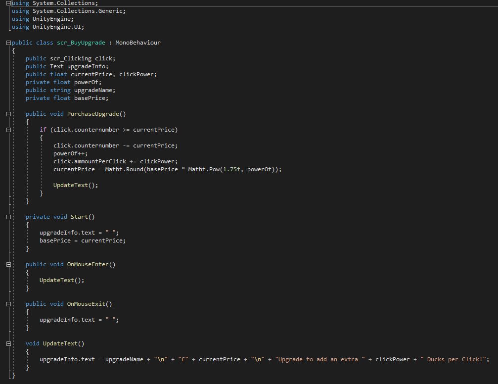
Simply put, this code subtracts a given value from your current amount of ducks if you have enough to afford it. It checks whether the current value is greater than or equal to the price of the upgrade, if so the next part of code is given clearance to happen which increases the amount you gain per click. following this it then increases its original asking price and via multiplying it by the number states and rounds it upwards.

All the Text below this allows text to appear underneath the UI element the script is bound to, which will display its current updated price.

Before creating another upgrade, I first created a new script to allow my count to increase automatically

The Bool variable has two states: true or false. This was used to make sure when another script wanted to start producing ducks automatically, it had to be done by calling this script. by doing this it means other scripts are less cluttered and easier to debug.

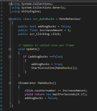
This script allows for the counter number to start increasing its duck count without player input. It first initialises itself and then starts a coroutine to make 1 duck every 0.1 seconds.

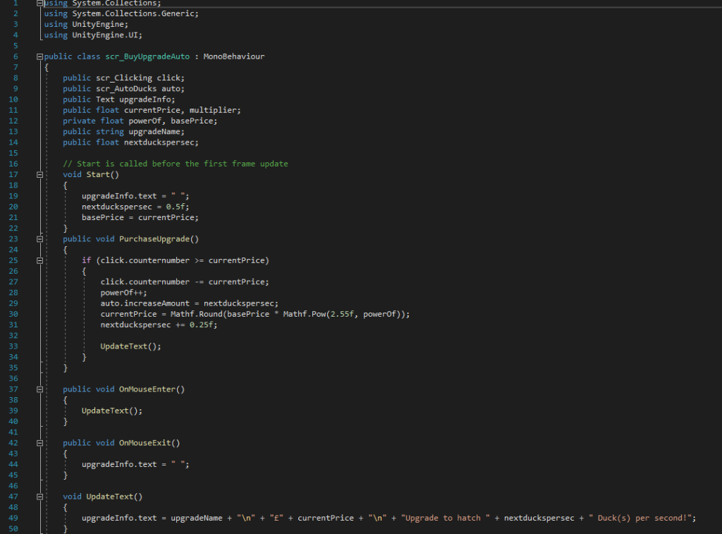
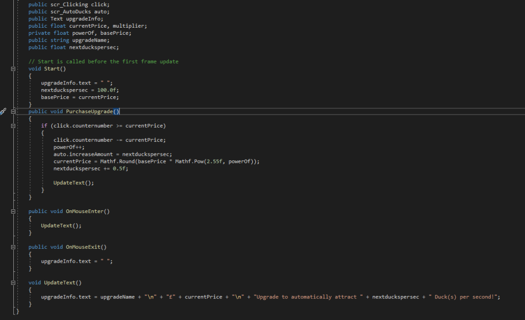
Much like the upgrade before it, this starts by comparing the count of ducks to its own value. If it is greater, it automatically increases the duck count by its assigned value, before then increasing its price but also the amount of ducks you gain per second. which is done in the “nextduckpersec += 0.25f” line.

the bottom half of the code also displays a message when the mouse is hovered over the object it is bound to. displaying the price and increased amount of ducks you gain. This is activated by the “OnMouseEnter” trigger

I also created an identical script, scrAuto2, to be used for a similar but more expensive upgrade.

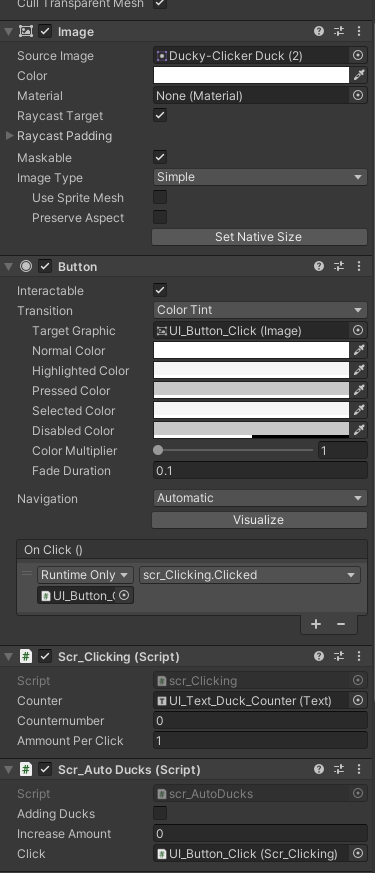
After Creating these scripts I then had to bind them to the appropriate buttons. which was simply dragging the correct scripts into the inspect editor of the button and selecting the correct variables

On click allows the script to run when the button is clicked by the players, however that doesn’t mean the effects will occur due to the system of checking the price within the script itself

Finishing Touches

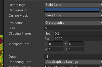
Following testing and making sure all aspects of my script were indeed working correctly, I then began to make some quality of life improvements such as changing the camera colour within the inspector to be a blue colour to imitate a pond, as well was texturing my upgrade buttons and giving them text. other UI elements like the boarder were also added onto the canvas after a small bit of trouble regarding scaling however that was eventually resolved.

Camera Background Colour

I added theming such as reeds and the title of the game in the top left, alongside naming my upgrades different types of food you made feed ducks with at the park, again partaking in the theme of my project.

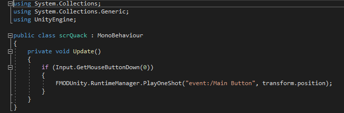
I also implemented Fmod into my scene and added a short script so that when the player clicks a Quack sound effect (Sourced from: https://freesound.org/people/DrMaysta/sounds/418509/) would play adding to the theming of the project alongside some calming music i attached to the camera via an emitter component.

scrQuack is triggered each time left mouse button is pressed

Conclusion

This was a rough project for me to complete, and whilst I am proud of the result of my work I still had concepts of buttons that would move across the screen to give a big boost to your counter. there was many idea I feel as though I could’ve added however couldn’t due to time constraints and lack of technical knowledge. I particularly felt lost when I was having trouble trying to add the auto upgrade script. I definitely feel that one glaring fault in the unity editor is that it isn’t specific enough with its errors. Languages like python return what line the error is on, which is a big benefit for debugging. I feel as though a similar feature could work well within unity.

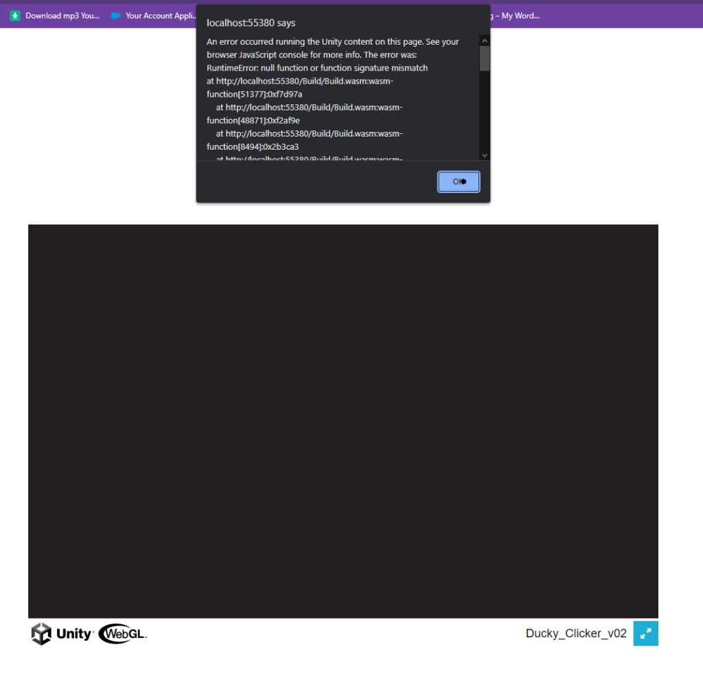
My problems didn’t end there as I was unable to figure out how to package my scene as a WebGL either as no matter what I tried I couldn’t make it run as a HTML.

Despite needing to familiarise myself with C# as well as use better coding practises, i left this project feeling proud of what I accomplished (especially the nostalgic early 2000s web game UI which I think fits nicely with my tranquil theme) and look to build upon my skills in future projects

The Project is able to be Downloaded Here:

https://anonamigo.itch.io/ducky-clickr-20

Categories
Uncategorized

3D Asset Design

Assignment Brief:

For this module, I was tasked to create an asset that would act as the centrepiece for a future module. However, our asset had to fit into one Main and Subtheme:

Main Themes:

  • Horror
  • Science Fiction
  • Fantasy
  • Historical

Sub-themes: 

  • Alien
  • Corruption
  • Utopia
  • Dystopia
  • Celebration
  • Decay
  • Family
  • Beauty

The aim was to create a low poly asset with complete textures as well as fully rendered beauty shots in Arnold renderer. Baking a high poly asset and low poly asset would also be worth greater marks.

Planning and Research

Following some experimentation with Maya and substance painter within the workshops, I settled on my theme: Horror and Celebration.

I was drawn to these themes as typically these would be looked upon as opposites, thereby giving myself a unique spin for my assets. I began to do some research on how I could combine these theme’s. Being interested in history, I decided to look back for inspiration.

Before the turn of the new millennium I found many people looked forward with anticipation towards the new year more than usual. This was due to the new year also coinciding with a new millennia. The year 2000 specifically. Being born in 2004, I hadn’t experienced the phenomenon and thus began to research on the internet as well as asking older friends and relatives about what they remember. Through this research i found that some weren’t as excited as others as they were far too afraid of Y2K: aka the millennium bug. This hoax ran throughout the late 1990’s and really began to rise during the finally few months of the 20th century. The concept essentially foretold that due to our over reliance on computer systems, when the clock strikes midnight on the new year, many technologies will simultaneously fail, leading to outages, economical troubles and some speculators even believed certain death as planes would drop out of the sky and nuclear missile silos would malfunction. Whilst it sounds ridiculous now, there was some truth in the hoax, as many computer systems were designed for a 2 digit date system in mind rather than the 4 digit, this meant when the year 2000 arrived the system could potentially read it as 1900 and fail. (1)

With my inspiration in mind I came up with the idea in which Y2K did spell certain doom for all civilised life, My scene would take place in the post apocalyptic aftermath of a party surrounded by death and destruction, and standing solitary in the focus would be a celebration cake, smashed and covered in dust and filth from the rubble and devastation surrounding it.

I began to workshop some ideas via mood board and sketches:

Source: Google Images.

I began workshopping different styles of cake.

starting with a simple traybake style (bottom right). I continued to iterate on these designs and liked the look of a large grandiose cake, as it would look imposing yet melancholy when surrounded by my environment.

This cake would stand, as many do in the centre of the dining room, always elevated above other objects, and due to its large size, it would further draw attention from the viewer.

I eventually settled on a three tier cake with frosting on each layer and large decretive candles and numbers that would shine like a reminder of the horror.

Oozing and covered in soot and ash, this cake wouldn’t be something that looks pleasant to eat.

Process

After finally settling on a design I could use, I began blocking out the structure of my cake in Maya.

Before any modelling began however, I had to bear in mind my proportions, I edited my grid and placed in an image I had found off the internet that could act as a good sense of scale.

I began gathering the necessary assets for my low poly model.

Selecting Image pane adds a 2D Square (which acts like a plane) in which you can place a saved image for refrence
(2)

Next I selected a basic Cylinder which would act as the base and tiers of my cake. I then began using the transform tools to mold it similarly to what was seen in the image.

Furthermore, within the attributes editor I added extra subdivisions at the top of the cylinder, these then would be used by extruding them to create each tier of the cake.

Then I selected some vertices to create a rounder surface to the cake.

Then, using the soft select tool I highlighted a large area in which would be affected by the vertices movements, this is how i began to model the “smashed look to the cake”.

By lowering the indent created using the vertices as well as creating some extrusions and pushing them inward to create a nice natural dip.

Following this, I began to create the frosting along the rim of each tier. Using the multi cut tool. I marked out the basic outline I intended to follow, and using the extruder tool, I then dragged out the “icing layer” creating the nice effect. I did this for each following layer to ensure consistency across my asset.

Following this i began work on my additional assets that were to be used for decoration on the main cake. I began by taking a simple cone and changing its subdivisions to a 12×6 format, following this i then extruded the faces along the sides of the cone to create what looked like a dollop of cream.

I wasn’t satisfied with this however, I wanted it to be swirled as how you would typically see them presented on cake, therefore iu searched for ways to do this. I found the lattice tool under the deform menu and by selecting my swirl and the vertices I was able to deform the object by transforming the lattice, using the rotate tool.

I would proceed to Ctrl + D this model and discard the original to be used later.

I then employed a similar technique to create the candles. Once again using the extrude and multi-cut tools to create the ridges and wick of the candle. I used the lattice deform to give them their signature spiral as you typically see on birthday candles.

Following this I then used the text tool to create the numbers that would appear along the cake, this was simple enough however i did have some problems with bevelling and its depth, however i soon restarted and overcame that hiccup.

I decided to use the multi-cut tool once again to create a base for the cream dollops and also so the model would look more natural when bevelled. extruding it out I created a short platform to place the decorations and started to add them in place, using the transform functions in the attribute editor to arrange them accurately.

The final low poly block out I settled on

Somewhere during this time I also made an error and lost part of the base of my cake, therefore I had to edit my mistake using the bridge tool between the gap.

Following this I began to add bevels and subdivisions to my model, particularly around the icing to make it look smoother and more natural for my highpoly model.

Texturing

With my high and low poly models finished it was time to move over into substance painter, however I first had two things to complete before they were ready to be textured. First I had to alter the UV maps of each part of my model, this took some time as I’m not familiar with doing so, however i believe this came out well in the end

Following this i then had to bake my high and low poly models together to create a lowpoly yet smooth and detailed model, i placed both models into substance and let it bake.

However following this i then had to retreat back to Maya to texture the different parts of my UV to coincide with each different texture to be used, this was made using simple lambert colours so it colour be viewed as a different part of the model in substance painter.

I began gathering textures for my model through the substance painter market place as well as using ones built into the program. I experimented with some of the masks available to grime up my model so it seemed mouldy and dirty.

I used the normal brush and eraser tools for the finer details such as the candle wick and placed the textures according to my maps on some designated sections like the main body of the cake.

Above is the series of textures I exported back into Maya

Finishing touches

With the texturing and modelling done, all there was left to do was re applying the textures in Maya and rendering in Arnold, However this is where I ran into a key problem my textures wouldnt load, either importing them directly or using the substance painter plug in which left my model looking like this:

Furthermore due to the issue, the model would appear purely blacked out when rendered as if there was no specular map, I checked within hyper shade window yet couldn’t come with a solution, so unfortunately my model count render whatsoever.

Reflection and conclusion

This posed as a serious challenge for me as I simply couldn’t get my textures to work using Arnold renderer whatsoever, however my peers and i assessed my model was of good quality if not a bit high on the poly count. Truth be told I’m really disappointed with this as i tired hard with the model.

Final High poly asset (pre texture)

References

(1) Y2K BUG:https://www.britannica.com/technology/Y2K-bug

Categories
Art and Animation Fundamentals

Week 10: principles of Animation

For our final week of this assignment, I we was challenged to create a 2D animation in unity utilising a PSB file. Using bone rigging. we were tasked to created several animations for the character to be used by using the bones to create key frames of animation.

Before we were to do this however, we were to learn how to create fluid and convincing animation.

12 Priniciples of Animation

1 Squash and Stretch: The first and one of the most important principles is squash and stretch. This makes all objects malleable and almost elastic-like in properties. Objects are distorted to give a better sense of movement

2 Anticipation: This refers to frames proceeding the action in question, such as bending your knees before a jump. This highlights whats called the follow through action. The action which happens afterwards.

3 Staging: How you frame a scene is essentially another word for staging. This allows the animator to clearly show an action or place by what perspective they animate it from. Its much easier for the audience to read a ball being thrown from side angle than from the front

4 Straight ahead and pose to pose: These are two opposing ways to draw animation. These are drawing each frame sub sequentially and the first and last frames, then filling in the gaps respectively. one allows greater creativity and the other greater control.

5 Follow through and overlapping action: This refers to how the change in movement of one object can impact another, such as hair being influenced by a characters movement.

6 Ease in/out: These terms refers to how whilst an object may stop, the inertia of the object must still be displayed through some small movement after the object stops.

7 Arcs: These give a natural and smooth looking flow to objects, natural objects cannot have precise movement, therefore moving the object in an arc like a human elbow will make the object seem less robotic.

8 Secondary action: These are additions to the primary action to give it more character. Dusting yourself off after picking yourself back up would be an example of this as it gives the character more personality.

9 Timing: this boils down to fewer frames for faster objects, more for slower objects

10 Exaggeration: This includes distortion in facial expressions, Emphasised movements etc. This adds personality to the animation and can be done for comedic effect.

11 Solid Drawing: This refers to the quality of the drawing itself, making sure that the character is suitable for its environment, and can be visualised as an actual object, details must follow the contours and edges of a surface.

12 Appeal; This relates to the general appeal of the object on the public. a suitable art style as well as colours and balance of the piece help achieve this.

(1)

Implementation

After importing the provided file from the university. We began to create the rigging for the sprite within the sprite editor.

This image depicts the bones I added to the character.

Opening the sprite editor we began by selecting the skinning editor and created a root bone for the sprite. This bone would connect all other bones within the sprite and anchor them to the centre (pelvis) of the sprite.

Following this we made bones for each limb, placing them along the arms and legs of the sprite and naming them with the naming convention we had put into place. (e.g. Hand_F). Using the split bone tool we also added extra detail to bones by splitting them into two.

Following this we added the weights to the bones so they may be controlled

Furthermore we checked the sprite influence of each bone by removing any sprites listed that the bone should not effect. this would minimise warping when animating.

Finally we then assigned components to this sprite. Inverse Kinematics component allowed us to create limbs that could be controlled for each part of the sprite.

Then it was time to put this set up into action:

Idle
Walking
Running

Evaluation

I attempted to take the primary concepts into my animations within the keyframes of my animation. However I definitely could improve this in future and create better loops.

However this feature is very beneficial as I can use this within future projects.

References

(1) Ritchie, J (2017) https://idearocketanimation.com/13721-12-principles-of-animation-gifs/

Categories
Art and Animation Fundamentals

Week 9: Sprite Sheets

Following on from our pixel art task in week 6, week 9 brought about a task to create a sprite sheet. This would consist of us creating a myriad of differing assets alongside animations for said assets. Once several assets would be compiles onto one image and saved as to conserve memory on older games consoles. In this task we would be following in their footsteps, despite this issue not being so much a problem nowadays.

We had the choice to design from one of two briefs: A Character or Environment Designer. I chose to create sprites for the environment. This required us to create the following:

Environmental Hazards (X2)

An Explosion effect that must be reusable

A projectile

A Selection of Collectables (X2)

Creation

As per the norm, I began by creating a Photoshop file, this time with the dimensions of 384×384, 72 DPI on a transparent background. Following this I then created a grid via the preferences menu. This allowed my sprites to be held in a uniform way with each cell being 32×32 pixels.

Finalised Sprite atlas.

The brief stated that the sprites fit a fantasy platformer game suitable for younger audiences. Therefore when creating my design I made sure to create my sprites to be vibrant, cartoony and simple for a younger audience.

My first sprite consists of a missile that would move down/left towards the player from the top of the screen. The Fire and contrails move on the sprite to give the object a sense of inertia as it falls.

My second sprite is a strawberry. Intended as a Health collectable. I intended to have the strawberry spin in place via moving the seeds and stem in a circular motion. I believe I could of improved this aspect

Third was a coin collectable, found in all sorts of platformer games. similarly this also spins. I also added a highlight along the coin to make it seem metallic. I made the spinning effect this time by shrinking the size of the coins face whilst increasing the border and then flipping this horizontally for the opposite side.

The fire was intended as an environmental hazard. I designed the different flames to dance and move wildly. I also included some embers to rise around the flames.

Another environmental hazard was a cartoonish black bomb. The fuse on this bomb slowly dwindles overtime, whilst the fuse is still there this object is safe to touch. as the lit fuse gets closer to the black metal, Highlight begins to go rom white to orange.

I created a greyscale explosion next, this was done so that it may be used alongside the missile and bomb. Furthermore it can be left greyscale to simulate smoke. or the hue of the sprite can be altered within unity to create a fiery explosion or a myriad of differing colours.

My seventh sprite was a toxic puddle which would bubble idly. These bubbles would burst if they got too big. I incorporated different hues of green into my palette to show the shaded areas and highlights upon the puddle, Making it look more liquid-like.

This Punch projectile would travel forward from the player, leaving a trail of purple particles. Upon collision with an enemy, the Explosion effect could be reused once more.

Finally I created a 3/4 perspective chest. I included a transparent colour within the chest to represent a radiating glow from within. This by Far was the hardest sprite to create due to the perspective. Upon opening, coins the character have been collecting could be awarded.

Evaluation

I improved upon my use of sprites and palettes from when I first attempted. Comparing the animations I had made previously to these ones is a night and day difference to me, of which I am proud.

I will use sprite sheets for assignments going forward as it provides a useful set of frames to be used.

Categories
Art and Animation Fundamentals

Week 8: Anatomy

In order for us to create realistic and well designed characters to act as protagonists, enemies and NPC’s within our games, we first needed to have a baseline knowledge of basic anatomy. This would allow us to create humanoid characters that are correctly anatomically proportioned, meaning that the shapes that comprise the body (what represent the muscles) are correctly sized. This is important to bare in mind whilst creating our designs to avoid our characters looking odd, or looming into the realm of the uncanny valley (This is a term to describe how certain humanoid objects or portraits can cause a sense of unease within humans (1))

This week, our task was to create our own character design whilst bearing in mind the rules of anatomy as well as drawing our character from a three quarter perspective. This perspective was used as it is commonly used in media, from cartoons to style sheets, not only does it challenge the artist. it also gives a good sense of depth as well as providing a look to the front and side angles of the body.

Creation

Using the graphics tablet and photoshop software I was familiar with. I began work on my character. I knew from the beginning that I wanted to create a male figure, therefore the proportions would generally be larger in comparison to that of a woman’s. I kept this in mind as I started to sculpt their skeletal structure. The university had provided us with a reference image (Seen below) that includes: Hight in heads, a rudimentary skeleton, A sketch of key muscles, a refined outline and a more detailed outline.

In this it showed how a 3/4 perspective drawing should look, alongside a true sense of scale via the heads and skeleton. However, as I was creating a male character, I would have to alter said proportions depicted within the diagram.

Reference guide (2)

From here, I used the pencil tool to begin creating my character design. I kept in mind my proportions, using the 8 head rule I created the height of my character as well as accurately sized the shoulders and waist of a male character. I began working from the layers built atop the skeleton and created a basic muscle outline for my character. Whilst I was doing so, I had the thought to base my design around 1980’s action movie hero’s, as well as the clichés that come alongside them. I made sure to incorporate shape theory into my design. Since my character had to be strong and dependable I added boxy elements such as his squared shoulders.

When I began to layer clothing atop my character I thought of my inspiration to create a definitive look for my characters. I took inspiration from different film franchises to finalise my character look.

Indiana Jones was a key inspiration for my character (3)
As a fan of the Evil Dead franchise, I was also inspired by Ash Williams’ Design (4)

I again kept in mind my inspiration during detailing and colouring my character. Using the eraser and colour picker to create a consistent palette for my design. I made note to give my characters key features, such as the bandanna and scars to show an insight into the characters without stating as such. I made sure that my character incorporated light colours and rounded edges to show that whilst he is strong and dangerous, he also fights for good.

Finalised work

Evaluation

Whilst I like the current design I created, I would be amiss if I didn’t mention how I could’ve incorporated more techniques to create a more visually striking design. At current my design is quite flat and boring. using some shading and lighting skills I have learned previously would allow me to add some depth to the character. furthermore whilst i believe my use of proportions was well implemented I could’ve used some techniques such as gesture drawing (dynamically posing the design to add to the emotion or story of the character).

Overall this was a fun way to experiment with character design and I can definitely feel as though my proportions will improve going forward alongside my use of shape and colour theory.

Refrences

(1) Cherry, K (2022) https://www.verywellmind.com/what-is-the-uncanny-valley-4846247

(2) University of Hull (2022)

(3) Indiana Jones and the Temple of doom (1984) Lucasfilm , Disney

(4)Army of Darkness (1992) Universal Pictures

Categories
Art and Animation Fundamentals

Week 6: Pixel Art

Our task this week was to use a style as old as the video game industry itself. Pixel art. This was to be done for our final prototype within our Games design and prototyping module.

Now by this point I already decided what I was going to create my platforming prototype about. My stimulus would be my earlier work within this module. I was inspired by the previous idea I had during my first lecture as well as what I created my first piece of concept art around.

Concept art in question

However before this I had already tried my hand at pixel art for a previous prototype:

Main Playable character
Enemy pirate
Projectile to be fired at the enemy

These first attempts at pixel art were nit my greatest work, therefore to avoid making the same mistake again, I decided to learn from my previous work using the knowledge of colour and shape theory as well as what I had learned within the lectures.

Techniques

Pixel Art originated not as an art form, rather a necessity. During the early console generations, its well known fact that the systems they had then weren’t nearly as powerful as we have today. Moreover high definition displays were merely a dream and 3D was out of the question entirely. Instead, due the small processing power and amount of ram these devices had, the aim was to create simple and easy to recognise assets. Due to these limitations, the developers needed to employ special techniques to ensure the art was easy to read and small.

Pixel Art is usually created within powers of 2, such as 64×64, 32×32 or 16×16. The fewer pixels, the less detail you can achieve. On top of that early consoles like the NES could only display a pitiful 256 colours. therefore, special colour palettes were used to compliment the coloured used within the art, alongside to reduce memory usage.

However a lower range of colours means less accurate detailing and shading. Therefore, a technique called dithering was used. The aim was to create better transitions between colours without the essential in-between shades, therefore the pixels would be drawn so they slowly transition into another colour by placing them at equidistant lengths from the opposing colour. Similar to crosshatching when drawing. While this worked sparingly on old CRT monitors used back then, it isn’t so suitable today. As our screens now have a higher fidelity so we can clearly see the in-between pixels. Luckily (?), this can be used to create a “retro” styled look to your art, despite the art never actually looking like that on older hardware.

There were some trappings to avoid however. Line art shouldn’t be used as unless it used as an artistic choice (below) it makes the art look flat. Furthermore caution should be taken when upscaling small pixel art, as Antialiasing can ruin sprites by softening edges.

Yoshi’s island SNES (1)

Finally it is also important to make sure your art has a decent silhouette to it. Making sure the characters were easily recognisable as it could be the difference between a power-up or a death. The shape of the character needs to be clear to the audience.

Main Character

Before I began creating my main playable character I knew I had to alter his design from my initial concept art. This was due to the fact previously I had issues of my sprites blending into the background Therefore I knew I had to change its colour. The finished result looked like this:

Finalised design

I decided to shake up the colours of the sprite and add a few new additions to his design. I used my knowledge of colour theory to change his fur colour from grey to lighter brown, I was worried that once again my sprites would be poorly visible against a dark background. The brown also show the ruggedness and simple-ness of the rodent. This is enforced by the chunk I had removed from his ear. The pink symbolises its innocence and fragility and Finally the red scarf was added to not only alleviate visibility issues, but also to add some charm to the character. it is coloured so to represent the animals courage for fighting against the desolate city in which it roams.

I attempted to employ some of the techniques used by pixel artists as well such as directional lighting from the right, with shadows along his back and under his arms, as well as some highlights in his eyes, ears and nose. (However the latter are very faint). I also tested whether the character had a cohesive silhouette:

Identifiable via only the shape

Following this I began to add some frames of animation

Walking right animation.
Jumping animation
Idle for facing right

These were to be used dependant on the player actions, I also flipped these for the case in which the player was facing or going left.

Each animation conveys the little pitter-patter of a rodent I was after and the idle wags the tail and allows the scarf to blow in the wind.

Of course I don’t like how little frames there are to each animation, especially the walking I believe that could use some in-betweens , therefore in future I will change this to include multiple frames of animation.

Onto of that I will make sure to create both a left facing and right facing sprite set as the shading and details such as the bite in its ear are flipped which doesn’t make much sense from a lighting and consistency standpoint.

Hazards

I created two types of hazard for the player to avoid, these were themed around the playable character:

Cat paw enemy

I created this enemy to be jumped upon, therefore I needed it to look somewhat friendly whilst still showing its aggression. By creating a rounded cat paw. the player may be invited to interact with it. of they jump on it a bounce is rewarded. however I hinted at its aggressive side with its sharp, triangular claws. This implies the underlying evil that the player would find out if they was to collide with it.

Mouse trap

This Hazard I tried to look much less inviting, despite the block of cheese. You will notice the shape of the trap itself is made up of triangles, implying its danger, even the cheese is triangular and a bright yellow. subtly warning the player to not touch it, otherwise they die.

Platforms and Decorations

I created a multitude of assets to decorate my scene with, however due time constraints I was not able to create all I wanted to.

This was the primary ground used throughout my game. there is some limited use of highlights along the edge of the bricks
This tablecloth was used in tandem with a leg sprite to create tables rather than having floating platforms.
A darkened edit of the brick texture, cracked and smashed, this was used as a background element
This mousehole tile was used as the end goal of the stage
Table leg texture, used in the background in front of the brick texture.

Evaluation

I believe this attempt at pixel art, Far exceeds my previous attempt. By putting the techniques I had learned about into practice, this allowed me exceed the mistakes such as line art and improper shading i used in my original series of images.

In the end however, two things I definitely need to improve on is my animation and tile work. Unfortunately I don’t think either of these aspects were up to scratch with my usual standard.

References

(1) Nintendo (1995) Yoshi’s Island

Categories
Art and Animation Fundamentals

Week 4: Composition Perspective Drawing

To expand our knowledge and technical proficiency with 2D art, we needed to know how give our 2D images a sense of depth. This was important as it gives us a baseline on how to create realistic and improved concept art, especially for 3D Games.

Our task this week was to experiment with the composition techniques shown to us and create a perspective piece drawing.

Composition

When trying to give an object a sense of depth on a 2D plane, a technique called perspective, needs to be utilised. One point perspective is the first, and most simple variation of this. Simply put, there is one area of focus called the vanishing points, all objects drawn should begin to shrink the closer they get towards the vanishing point. when drawing at a one point perspective, draw the image as u would see it if from a 2d perspective, then begin to add the depth either above or below the shape. This is dependant upon if the shape in question is above or below the horizon line ( The x axis of the vanishing point).

Similarly there is 2 point perspective, where there are two vanishing points on the image. rather than drawing from the face of the shape, instead you begin to draw from the edge. There is also 3, 4, 5 and 6 point perspectives, each with a greater amount of vanishing points, allowing the user to see more sides to the object. Most of these are unimportant to my task however.

Finally its important to utilise the rule of thirds. As the name suggests this divides the image into thirds using two horizontal and vertical lines. Your art should be drawn to fit these thirds. Furthermore the focal point (the area you want the viewer to be drawn towards) should be placed along the intersect of these lines. This is useful as that is where I will place the vanishing point within my art.

Creation

Once again we are into Photoshop using the graphics tablet. Setting up a 1920×1080 72 ppi canvas to work on, i then imported a Thirds grid premade for us. I placed the grid on its own layer against where I will be drawing.

I then created a line along using the line tool the x axis of one of the intersects, thereby creating the horizon line. Using a polygon tool, I then created a star like shape to show all the tangents my work should be running along. I did this by setting the number of sides to 100 and setting the star ratio to 1%. I then added this polygon and enlarged it so it encompassed my entire canvas. The centre of this polygon would be my vanishing points so I placed it upon the horizon line in line with the thirds intersection (bottom left intersection).

It ended up looking like so:

One point perspective drawing

I tried by taking inspiration from a train station platform. not dissimilar to the ones you would find in York and the like. However whilst I made an attempt at creating different walls and challenged myself by adding curves and depth to what is supposed to be the bed in what the train track sits. I did end up struggling to create each wall, especially with all the guides and lines as it I couldn’t focus properly. However i made sure that all lines would be heading towards the vanishing point. including the hills in the back.

Evaluation

Whilst I have some experience drawing at one and two point perspectives I not only found that it makes quite a difference to the quality of your piece, but also how it is not an easy thing to accomplish. Whilst difficult to first wrap you head around. those key golden rules of thirds and vanishing points really allowed me to feel as though I could make a significant step up within my artwork. I am glad I only attempted a one point perspective piece. In the end I wish to expand on this further as this does not satisfy what I believe I can dousing these techniques, despite it taking significantly longer than I initially expected.

I believe the key basic elements are there so that someone could recognise what this is meant to be. however to improve on this I would try to add some colour and greater detail alongside some realistic shading because as it stands it looks very basic.

Categories
Art and Animation Fundamentals

Week 5: Colour and Shape Theory + Top Down Shooter sprites

In week 5 we covered the essentials of shape and colour theory and how that is essential when creating you own unique character designs. The colours used and the shapes which make up your character can subconsciously effect how the player views said character. This is because our brains naturally associates attributes to these aspects of design.

Our task was to take what we had learned from this, and implement it whilst we created sprites for another prototype of ours (a top down shooter).

Colour

Colour can be used to manipulate the emotion a person feels towards an object, character, brand, etc. This is done frequently in all kinds of media such as in shows, adverts, book covers, and of course games. When you see an advert trying to sell you toothpaste, they use whites and blues as these colours represent cleanliness, perfection as well as strength and dependence. those colours work for the product they are trying to sell, However if they were to use browns and greens you would automatically be less inclined to buy the product as your brain associates such colours with grime and disease. Not all colours have just bad connotations however, many colours can invoke opposite emotions. Red for example can invoke excitement yet also be scary with its ties to blood, it all depends on the context of which it is used.

The Hue refers to a colour’s wavelength. Warmer colours such as Red’s, Orange’s and Yellows invokes feelings of excitement and high energy; Colder colours however invoke calm feelings and low energy. This can also be considered when designing your character.

Consider using complimentary palettes when designing characters as well. This boils down to colours that look pleasant together (A good tool I used is adobe colour wheel (1)). Characters with contrasting palettes, especially those with high saturation (the intensity of the colour), may be unappealing and will not look nice on the eyes. A good colour palette is essential for good design.

Shape

Much like how colour can give positive and negative annotations to the brain, the use of shape within a design can do that also. There are 4 main aspects about shape to consider.

Circular shapes are good at invoking friendly emotions into a character, they are not threatening and look organic to us. This can be used to create a warmth about a character as circles look harmless and inviting

Squares are strong and reliable. They can be used to create a dependable looking character as they always look balanced and sturdy like a building. On the other hand they can be used to create an intimidating character due to those same properties. However rounding the sharp edges of these designs can be used to reduce feeling, making them look friendlier due to incorporating some circular design.

Triangles are not organic as well as sharp and aggressive. Much like the head of an arrow, triangles show direction. By exaggerating the points of a triangle this can be used to induce emotions such as fear.

Finally, Silhouettes are key when designing a recognisable character design. Silhouettes essentially means the outline or shape of the character. A good silhouette will highlight the primary features of a character or the main shapes that compose of it. A good silhouette indicates a good focus in character. A good example of a good silhouette is Sonic the Hedgehog: The key features of his design are immediately viewable, such as his large shoes which indicate he is a runner as well as his long spines that show the “90’s edge” on the character, triangles were used to make him seem less friendly and more “cool”.

Sonic Silhouette (1)

Implementation

Now I understood the basics of colour and shape theory, I could begin work on my sprites for my top down shooter. However I needed an inspiration for my assets. The night before my lab session however, I was asked to play a Call of Duty® Black Ops 3 (2) Zombies mode. We played on the map Origins, which is set during WW1 rather the common WW2 setting. Following this I took my interest in the world wars once again to influence my designs. Whilst initially thought to be quite cliché, I enjoyed translating their uniforms and weaponry into a top down style.

Once again I set up a new Photoshop project, this time with the dimensions of 256×256 pixels whilst also enabling artboards. This allowed me to created duplicates of my canvas so I could work alongside my previous designs for scaling reasons as well as export them together.

Since I was unfamiliar with creating top down assets i found some images online I used for referencing:

Soldier inspiration (3)
Zombie Inspiration (4)

Once I had created a suitable naming convention for each asset (those being, player, enemy and bullet) I began to work on my player controlled character.

Whilst creating my character I needed to make sure my character looked both reliable, and friendly to the user. I decided to use a British mark 1 brodie helmet, such as this one:

Brodie Helmet, commonly used by the British light infantry from 1915 onwards (5)

I decided to colour it green to symbolise peace, good and security rather than its average brown colour seen during the war (which was a means of camouflage). The same circular imagery was used when I decided to use the Lewis gun as a gun for the player to hold due to its iconic circular magazine. I also included rounded off squares for the soldiers pouches, invocative of his strong yet dependable nature.

Finalised Design

I also included a personal feature, that being the KOYLI (Kings own Yorkshire Light Infantry) badge on the soldiers right arm as this was battalion in which my ancestors fought.

As for the enemy design, I of course based off the German officer uniforms that appeared along the western front. This design was to include many more triangles as opposed to the previous, to show the enemies hostility. In contrast to the Brodie helmet used for the British, I instead chose the iconic Pickelhaube helmet due to its recognisable golden spike atop the helmet. this of course fit the exact shape language I was looking for in such an enemy.

Pickelhaube Helmet, which was used up until 1916, placing my game sometime between 1915-16 (6)

I added other spiked elements from the ripped uniform to the jagged claw-like fingers. I also coloured their uniforms darker blacks and greys as they are synonymous with death and added red blood and green skin to emphasise the themes of horror and plague.

Finalised design

I also created two additional styles for enemy variety:

Faster “Officer” enemy

This enemy is a darker black to draw attention to the player as well as emphasising the theme of death as this is a faster, deadlier enemy.

Potential Fire based projectile enemy.

For the fire enemy in particular, I changed the hue of the regular enemy to create the warmer palette which is evocative of fire.

Finally I created bullet sprite so the player could shoot the zombies:

Bullet Projectile

I didn’t do anything too fancy here, simply created a rounded point to show its lethality yet it is friendly to you the player. I also attempted some distortion effects but these could be improved.

Evaluation

In the end, I think I displayed a good use of colour and shape theory within my sprites whilst also keeping them accurate to my initial stimulus. If I was to improve on anything though it would be my use of shape, without the restrictions of a historical setting, I could use much more interesting shapes within my designs. Overall there improvements to be made with each design. However I feel proud of these assets as a lot of care and attention was put into their designs due to it being a personal interest of mine despite some considering the stimulus to be well covered.

If I have learned anything from this task however its:

A: Know your limits

I had multiple assets as well as a trench themed “map” that I had created on artboards as wellto be used within my final project however either got cut due to time or unfortunately lost.

Unused fireball projectile for the fire enemy

B: Consider gameplay as well as design

Due to my theme, ironically enough the characters blended into the background due to their camouflage, this was fixed in the final released however by making a much darker background.

References

(1) CyclonX64 (2014) https://www.deviantart.com/cyclonx64/art/Sonic-Silhouette-471413874

(2) Activision (2015) https://www.callofduty.com/uk/en/blackops3

(3) Gombart, R (2015) https://opengameart.org/content/animated-top-down-survivor-player

(4) Gombart, R (2015) https://opengameart.org/content/animated-top-down-zombie

(5) Rix, H (2015) https://ww1.nam.ac.uk/1904/news/brodie-helmet/#.Y5q8lHbP0uU

(6) https://en.wikipedia.org/wiki/Pickelhaube

Categories
Art and Animation Fundamentals

Week 3: UI Design

For our third task, we would be stepping away from photoshop into its sister program, Adobe Illustrator. This was because we would be creating the UI associated with the prototype of a “Cookie Clicker” styled game we was to make in the Games Design and Prototyping course.

(The result of which can be seen here: https://baines-2022.hulldesign.co.uk/2022/11/24/prototype-1-ducky-clickr/)

My goal for this task was to create a series of applicable buttons that could be used later down the line in unity for my prototype. By this point I had decided that my game was be themed around a duck pond, and as such should have a rustic calming feel to them, as well as being sort of playful like how it felt to feed the ducks as a child. my aim was to replicate this design philosophy into my UI.

Creation

Opening Illustrator I created a new project by setting my canvas size to 1920×1080 pixels, which would be the resolution my game would be played in. I also made sure the PPI (Pixels per Inch) was set to 72 alongside a transparent background, much like photoshop.

I started by creating a series of 3 different shapes.

An Ellipse:

An Oval:

And a Hexagon:

With the hexagon in particular I rounded out the edges at the left and right so it would it would better resemble the others.

For each button I added two bevels to give the buttons a sense of depth. This was done by selecting the “Effect” option in the top bar and navigate to the “Extrude & Bevel” option. Upon opening the new window I adjusted the values of the depth before repositioning the view to front facing and then altering the bevel height and width values.

Prior to this I created a drop shadow for each button by duplicating each, changing the hue to full black and decreasing the transparency to around 60%. I then layered the shadow beneath the button and grouped them as one asset.

I intentionally left these grey and unmarked so they could be used in many ways within my project, saving me the effort of creating a unique button for each button in the game. instead I could add the text and change the colour of the button within the unity editor.

Additionally I created a large rectangle that fit the whole screen and another rectangle inside it. I rounded the edges to each of them yet especially the upper rightmost corner. Following this I diffused the difference between the larger and smaller rectangle, deleting the smaller one, yet leaving a hole in the larger one with the same dimensions.

Following this I then filled the shape with a prebuilt pattern and a flat brown colour. when layered on top of each other I believe it looked similar to foliage around a pond. This was done to fit the games theme

This was the Result:

Upper layer
Lower Layer

These together would create the border for my game.

Finally I looked to create the primary button for the player to click whilst playing the game. I decided that the best course of action was to create my own unique button of a duck.

Opening photoshop once again. I used what I had learned previously from week one.

(Which can be seen here: https://baines-2022.hulldesign.co.uk/2022/12/15/week-1-intro-to-adobe-photoshop/)

I began to sketch out a duck using a reference I found on the internet (1) as inspiration for how its lighting and proportions should look. This was an attempt to improve on the mistakes I made whilst creating my environment.

Finalised Result

I gave the duck a Thick black outline to make it visually distinct to the player that it was supposed to be clicked. I also tried my hand at some improved shading. Furthermore I added a small ripple effect around the duck, so it would look as though it is floating in the water on the blue background of my prototype.

All of these assets were exported as PNG files so they had a transparent background. rather than a white one which would look odd within a games UI.

Implementation

Main UI for the Cookie clicker prototype

Once I had imported all the assets into my unity prototype, I made sure to alter the designs of the buttons. One to house the title of the game (purely decoration) Whilst the two other buttons were used to differentiate the two differing types of power ups (addition based and generation based) making visually distinct to the player what each does. I scaled the duck to be much larger than the other buttons and placed the counter above it to indicate to the player what it is used for. Finally I coloured the buttons brown to fit the rustic feel I was aiming for. I also added a font, aptly named “Ducky” (2) to the buttons, fitting the playful theme of the game.

Evaluation

I believe the UI elements I created perfectly capture the vibe and theming I was aiming for for the prototype. Despite this however a part of me does consider if I created unique assets much like the duck for the upgrades. I do enjoy the fact the the type of upgrade is visually noted by the shape of the button, perhaps I could of made a menu with the buttons I created for each type and given the upgrades an actual image as well. Nevertheless I believe my UI elements worked well with what I was aiming for. In future however I have learned that creating your own buttons aside from the tools given within the illustrator editor would prove for a more dynamic looking product, as well as making sure they are reusable, as this saved me lots of time in the end.

Refrences

(1) Baldwin, M (2008) https://www.flickr.com/photos/hooley/2599266595

(2) Seeduck (2021) https://www.dafont.com/duck-2.font

Categories
Art and Animation Fundamentals

Week 2: Photo Manipulation

Our task set for week to was to expand upon the knowledge we learned of photoshop during week 1. For this task we was to source our own series of images from creative commons sites (such as Unsplash) and create an environment by editing those images into a single scene. This technique was called Photo Bashing. This technique is great for drafting up composition for concept art as it speeds up the workflow by already giving some inspiration to the artist. Furthermore, if done correctly, it can produce a realistic looking image.

Concept

When thinking what to produce for my photo bashed image, I settled on an idea of a whimsical and vibrant port town. I started by Gathering some images from Unsplash and Pexels.

Hot air balloons I would populate the sky with, adding to the whimsical scene (1)
The sky background I would use for my main image (2)
The landscape i would use as the foreground to my image (3)
A slight fantasy element to draw the viewers eyes from the vibrant sky and town (4)

Once I had gathered these primary elements (alongside a few others) I then imported them into a new photoshop project.

Creation

Much as I had done previously i created separate layers to house each individual image. I placed my sky on the background layer and using the Magic wand tool, deleted the background on my port town image.

Similarly I used the “Layer via cut” option within select subject tool for my fantasy elements, so they had no background and was ready to be added to the scene.

Once each of my layers were correctly positioned. I then changed the hue and saturation of each layer to match that of the sky. this meant darkening each layer while also adding a slight blue hue. In the case of the tall ship however I instead increased the brightness of the image, as the source was quite dark and the details would be indistinguishable to the viewer if darkened any further.

With the layer that includes the ocean. I reduced the layer’s transparency effect so the northern lights could be seen reflected on the waters surface.

Following this is decided I wanted to have a shadow of the ship cast onto the waves much like the reflection of the light. therefore I copied the layer and decreased the brightness and transparency so that it appeared to be a shadow of the ship. I then transformed the image by rotating it 180 degrees so it would sit beneath the ships hull. Alongside this I also slightly stretched the image on the Y axis so the shadow would look distorted like in real life.

Before I was satisfied however I noted the colour of the bay water was different to that of the ocean behind it, therefore I experimented by used the colour picker tool, and began to paint over the bay in with a less opaque pencil so the colour of the bay would better match that of the sea.

Finalised Product

Evaluation

Whilst I am certainly happy with this attempt, I cannot help but think what more I could of done. rather than testing my skills I had learned in the previous sessions, I feel as though I had only utilised them again yet alongside other techniques to produce more authentic images.

In terms of what i experimented with during this task. I like the outcome of painting the bay a matching blue. However, I received peer feedback that the lights of aurora borealis shouldn’t look as they do in my image when they meet the horizon line. In future I will attempt to add some kind of distortion or mirroring effect so the reflections look truer to life.

Furthermore. I regret how the shadow of the tall ship is cast. I made a fatal error in this aspect as I inaccurately displayed how the shadow should look. rather than being stretched outward toward the town it should be shrunk and wrap around the bow of the ship. i would also try and create a more realistic shadow in future.

Overall though. my experiments with hue and brightness came out a success in comparison to my previous attempts I believe.

References

(1) Boehler, B (2020) https://unsplash.com/photos/jqdpdtPrKwc

(2) Vojtovicova, M (2021) https://unsplash.com/photos/7cfAzY0mj9w

(3) Claire, R (2019) https://www.pexels.com/photo/coastal-town-with-colorful-houses-4846529/

(4) Klavins, R (2021) https://unsplash.com/photos/mW51ftJqW6U

Categories
Art and Animation Fundamentals

Week 1: Intro to Adobe Photoshop

Part 1: Photoshop Basics

Upon starting this course I regarded myself as a novice with Adobe’s Photoshop software. I had used the program before for previous projects and within my studies however upon looking on the myriad of tools at ones disposal, I still found myself quite intimated by the sight of it.

Despite this my introductory class to this module would push me to conquer this feeling and acquaint myself with the features and tools within the editor. Lucky for me however, this began simply with a tour through the essential tools of the program and how to appropriately format my future works, This included but is not limited to: Setting the resolution scale of the piece, typically 72 DPI (Dots per inch) as its the standard for most screens, Adjusting the aspect ratio of the canvas and changing the background between white and transparent.

I first task to prove our competence was a simple “Cutting and Pasting” Job. In this task we used the Magic wand tool to highlight the background of an image of Saint Pauls Cathedral.

Original Picture (1)

By Selecting the background to this image, a dashed line would appear around said selected aspect. Click on the line would remove the selection and clicking within the line would increase the selected area.

The Dashed Line appeared like this (2)

I continuously clicked on the line as it grew to a larger size, encompassing most of the background surrounding the cathedral. However I would continue to find gaps within the selection due to clouds, or areas the image couldn’t identify as part of the sky, therefore I turned adjusted the tolerance slider for the magic want tool, present at the top of the window which alleviated some of my problems. Following this I then deleted the selection (Backspace) and cleaned up some of the smaller details via the eraser tool. I made sure to decrease the pixel size of the eraser as well as make sure I didn’t erase more of the image than necessary.

After the background was fully removed I had made a grave mistake however. As I had done all of this on the background layer. Therefore I created two new layers and labelled them “Foreground” and “Background” and placed them in a hierarchy which would lead the Foreground layer to be the top layer and vice-versa. I then deleted the original image on the original background layer, not before copy and pasting it onto the top layer.

Following this, I imported the sky image into the background layer and toggled the hue and saturation of the design within the Image settings. This was done as I believe the bright sky didn’t mesh will with the originally dimly lit image.

Finalised Image

Our secondary additional task was to edit an image to give a sense of motion. This once again utilised the use of the magic wand tool.

The second image used in these tasks (3)

Firstly, I selected the focus of the image (using the same aforementioned skills to enhance the selection), that being skater, and created a new layer to house a copy of only him. Following this reselected the following layer and accessed the filter menu to create a blurring effect. I selected a “Field Blur”. I then experimented with the settings within the blur’s menu until I found a suitable style. I did this as well with a “Spin Blur” in which a created a circle around the focal point of the image to blur to give the skater a sense of inertia.

My finished edit to the original Picture.

Part 2: Environment design

Following our introductory tasks to the software, we was given the reigns to go create something of own, so long as it was a concept for an original character or environment. In addition to this, we was also given a tool in which to work on, that being a graphics tablet. Whilst I had never used a graphics tablet before, I was familiar with drawing my own concept art for potential games I could create within my free time, so needless to say I was glad to draw with “Pen and Paper” rather than rely on the inbuilt shape tools and the mouse.

Inspiration

Rudimentary notes jotted down within my notebook

During our first lecture for this module, I had had an idea for a 2D Side scrolling platformer in which you would play as a mouse exploring the rubble of a destroyed city, squeezing through small holes to reach the goal. I was inspired by my own personal interest of British wartime history, particularly that of the Second World War and in this case, London during the Blitzkrieg bombings by German Luftwaffe between 1940-1941. I wanted this game to be played a smaller perspective as to not only increase the emotional impact of the damage (by making it seem so much greater and unconquerable) but also to serve as a unique platforming challenge, such as running across tables and avoiding drains as obstacles. This was inspired by games such as It takes Two as they play from a smaller perspective from that of a humans.

Photograph taken sometime around may 1941 in Liverpool, depicting the destruction caused by the blitz (4)

Sketching

Utilising the knowledge I had learned from the original tasks. I decided to use layers to give a sense of depth to my destroyed city. I would shade these with different colours to show the buildings begin to darken as they grew in distance. I blocked said buildings using the Rectangle tool, and then began to draw rubble in the matching colour to add to the silhouette.

For the night sky, I added a dark blue into purple gradient that would add a sense of depth to the sky, I also adorned this with stars and spotlights to make the view more dynamic. I decrease the transparency of the brush when I drew these elements to give a somewhat glowing effect to the lights.

An Unfinished draft of the final product. However plans are in place for details within each layer.

I then discovered that holding shift whilst drawing allows the user to input directly straight lines. I used this technique when detailing the brickwork on the nearest wall.

Following this I then used a different brush with the pencil tool and began to add texture to the objects within the scene. I also used to colour picker to select the same colours for different parts of the environment.

Finally I added some elements such as the rat, mousehole and table to give the scene some key points of focus as well as show the viewer the perspective of the piece.

Furthermore I added some greater detail such as fur on the rat, more rubble in the foreground and added shadows onto the brick all layer for everything in front of the wall to give a greater sense of depth. this was done by choosing a designated light source then drawing in the shading at 50% transparency to give an authentic look and feel.

Evaluation

Generally, I’m quite proud of the art that was made at the time, especially for my first use of a graphics tablet. I believe my work captures my theme quite well and I had incorporated what I had learned within the workshop sessions into my art. However, if I am to improve I need to work on my perspective and use of colour. Due to the minimal shading everything in my scene looks a bit flat, and without proper perspective, the illusion of depth I tried to create with the different layers may be lost as it can be viewed that each layer is atop one and other. However for a first attempt I believe the the themes and ideas I was trying to convey were made clearly within my artwork. I would also try and use more complex tools within photoshop to refine my work. However I did learn the basics of how to compose an environment.

References

(1) Occhi, M (2022) https://unsplash.com/photos/3K1TZ_RmLZc

(2) Morbey, T (2020) https://unsplash.com/photos/r1SwcagHVG0

(3) Adobe (2022) https://helpx.adobe.com/photoshop/using/tool-techniques/magic-wand-tool.html

(4) Unkown https://historyofliverpool.com/liverpool-blitz-photo-gallery/